@, &, etc.

Decades ago, when I worked in the graphics and typography industry, I became fascinated with ligatures * and “special characters” (which sounds like a euphemism of some kind). Some font designers seemed to share my interest and to design particularly elegant or amusing symbol characters and ligatures as options, though the classic ones have long since gone out of style.

The symbol ampersand supposedly evolved out of the Latin word et (as in et cetera), into “and per se and”–but now it simply means “and.”ampersand

fig2c

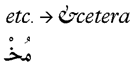
That character-ligature-symbol gets used frequently in logos, headlines, labels, cartoons. I like the over-the-top swash versions of ampersand just for fun, though I would not specify them in a design; they tend to be hard to read.

Several of the special characters find employment in legal documentation or academic writing, the only places you are likely to find  ‡, §, and ¶ . They’re quaintly antique, but useful. The symbol for “at,” however, was underused when I worked in the field in the 1970s and 80s. It seemed to be going the way of the §.

What a difference a world-wide web makes! Now, of course, @ is ubiquitous, instantly recognizable, and used in logos, brand names… etc.!

~

What we might notice here is that symbols change over time; status varies as social requirements vary, and what’s considered relevant or useful in one era or with one technology can fall into disuse or neglect depending upon the times. Do we regret their fall from grace? Perhaps for a generation or so, and then “they’re history.” If we value history, we geek around in scholarly or enthusiastic amateur ways, recovering past usages and the social norms of past eras. But we seldom insist upon a return to most of them. What endures overcomes the norms. I am curious as to what will endure.

Yes, this is another one of my analogies to the present moment.

~

@ 6 am
wren & sparrow chitt-errrr
etc.

(Just a lot of twitter noise.)

~~

*The etymology of the word is as follows (thank you Online Etymology Dictionary): c. 1400, “something used in tying or binding,” from Middle French ligature “a binding” (14c.), from Late Latin ligatura “a band,” from Latin ligatus, past participle of ligare “to bind” (from PIE root *leig- “to tie, bind”). In modern musical notation, “group of notes slurred together,” from 1590s; of letters joined in printing or writing from 1690s.

~

cf : The term ligature, when used in medicine, means a thread or cord that ties off a blood vessel. Now you know!

Outside the (type) box

Many years ago, back when there was a career called typographer, I was one. I apprenticed to typographers because I had superior proofreading skills, a background in art and design, there was a recession, jobs were few, and I was a quick learner. In an essentially blue-collar job, I was decidedly outside the box: I was a 21-year-old female with a BPhil in philosophy and literature. But I was a terrible waitress. So, in desperation, I essentially talked my way into a job at a typeshop in New York.

A voracious reader all my life, I felt attracted to the potential type offered for expression via the medium of words. I’d studied art since the second grade, so the aesthetic side of typography fascinated me, too. I got into the business just as the field was waning due to the innovations offered by phototype methods, digital typography, and the invention of desktop publishing. Nevertheless, typography kept me fed and housed for a few years while I learned to discern the differences between various counters, serifs, descenders, dashes,  x-heights, weights and the rest. I read books on the history of type design and the history of the alphabet itself. My obsession with words and letters kept me inside the typography box, though I suppose I was often more like a stray Caslon e in the Helvetica drawer.

Wood type was no longer in use, but I used to purchase wooden type fonts–the individual letters–and type cases, because they are so folk-art-appealing and so potentially useful. As collectors began to scour flea markets for wooden type, I bought metal fonts and slugs instead; I’m particularly fond of ampersands and dingbats. (If you’re in Wisconsin and you want to see what the age of wooden type in the USA was like, check out the Hamilton Wood Type and Printing Museum.)

Two of the shops I worked at still used metal type occasionally, though they had mostly switched to digitally-mastered film type; and one shop boasted three Linotype machines. Two of the machines worked. The other was there for parts. The typesetters were all WWII veterans, and the smell of molten lead wafted through the building…it really felt like the end of an era. And it was.

Mergenthaler’s Linotype machine

Working at typeshops engaged my brain in novel kinds of problem-solving and detailed observation, taught me about the lives and careers of men who could have been my great-uncles, satisfied–sometimes–my yearning for aesthetics in the workaday world. An elegant logo or headline still pleases me. I learned about all kinds of odd and wide-ranging things while proofreading, too, while I marked up thousands upon thousands of proof pages; and during my breaks, I read novels. One old-timer at a shop I used to work at told me, “Every proofreader I ever knew read books on his break.” He shook his head as if that were sheer lunacy.

Today, I might note that every computer programmer I know spends his or her break time (and post-work hours) at a computer. It is nice to love something about the work one does for a living.

Typographers today are designers and computer graphics folks who understand how to digitize and digitally set and “cut” fonts for virtual pages. The design tolerances are different, though the challenges of readability and clarity and appropriateness remain. As for proofreaders, there are fewer every year, even though we certainly could use them. AutoCorrect and SpellCheck are woefully inadequate proofreading systems, as I constantly remind my students who don’t know your from you’re or their from there or then from than.

And as for me, I have moved from proofreader and typographer to tutor, instructor, poet…jobs that suit me a bit better, where my quirkiness is more tolerated and thus more conventionally acceptable. I continue to admire thinking and being that is outside of the box, however, and in that spirit I offer you some artwork that moves type outside of its outmoded, old-fashioned box. Click on the cityscapes link to find metal-type cityscapes by Hong Seon Jang. For what artists can do with letters, see also my earlier post on Steve Tobin’s sculpture, “Syntax.”