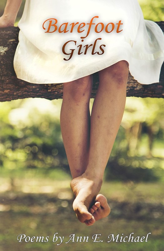
Coming this spring from Prolific Press.
~ ~ ~
Coming this spring from Prolific Press.
~ ~ ~
Simon Watts has died. Probably you have not heard of him. His father, Arthur Watts, was a talented illustrator for the British magazine Punch, among other publications. My readers are unlikely to be familiar with him, either. His sister, Marjorie-Ann Watts, is an illustrator, novelist, and memoir-writer in the UK. Her books are not readily available in the USA, so my readers probably do not know of her, alas. Simon’s maternal grandmother was Amy Dawson-Scott, aka “Sappho,” poet, novelist, and British literary hostess who founded English PEN. If you have not heard of her, you may have heard of PEN International, a major writers’ organization.
Oh, such interesting relations and associations!
Simon, who turned 90 a week ago, needs an elegy–but I cannot write one, at least not yet. We have been friends for 35 years; and even though he hasn’t lived nearby, we will miss his presence in our lives because he corresponded well. He sent letters, and emails with memoir documents attached, and photos. He kept up with our children even into their adulthood. He called us. We visited. He told the best stories–always mirthful and full of twists. He wrote articles on sailing, boatbuilding, furniture-making, and sent little essay-type memories to his friends and family.
He hailed from England, emigrated to the US in the 50s, and loved Nova Scotia, San Francisco, and Portugal. He has family in the US, Britain, and Australia.
~~
I was scouting about the internet looking at his work and his family’s stories and came upon his father’s article on drawing in black and white, written in 1934 about a year before Arthur’s early death (he died in an airplane accident). This section struck me as so relevant to my own understanding about both sketching and writing–good writing, poetry, journalism–is also, foremost, about observation and memory.
I believe I am right in saying that, ages before such a thing as photography was even guessed at, this was the method by which Chinese artists were taught … So developed did their powers of observation and memory become by this training that by shutting their eyes, opening them for the fraction of a second, and shutting them again, they could keep in their minds the visual image of what they saw long enough to be able to transfer that visual image to paper. It was in this manner that they were enabled to draw insects and birds in flight, and it is an indubitable fact that, when the camera was invented and ‘instantaneous’ pictures were produced, it was proved by comparison that these artists’ memorisations were perfectly accurate.

I tried that method myself, but, having no stern master to goad me on and, alas that I should have to say it, being constitutionally lazy, dropped it; for it is the most exhausting form of study that I know.
~~
Simon Watts, the son of this artist (a man he barely remembers), inherited somehow–though expressed in an entirely different way–the recognition that we ought to note carefully and recall the world around us, revel in our memories, and share our knowledge and wonder in whatever ways we can.
He saved historic wooden sailboats by carefully measuring them, building his own versions, and reproducing his designs for others to build.
In the photo below, my daughter, at age 14, happily sails the Atlantic off the coast of Nova Scotia in the boat that graces the cover of his plans for Building the Norwegian Pram.

Such memories fall into the category of immeasurably valuable. Right now, this photograph takes the place of any elegy I could compose. Sail on in peace, Simon!
The new year has certainly begun with bangs and whimpers.
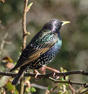
During the strangely mild weather, as snow geese and buzzards return but before the juncos leave us, I have been watching the flocking behavior of starlings.
For lack of anything more relevant to write at this time, I’m posting here my poem “Liturgy,” circa 2002 or 2003, from Small Things Rise and Go.
Peace.
~
LITURGY
We will not know peace.
Hay clogs the thresher,
Snow stoppers thruways.
Starlings haggle out the morning.
Red fox probes her muzzle
Into the voles’ weed bunkers;
Harrier screams over moors.
We will not know peace.
Here, the caterpillar
Tires chew fields into slog;
Here a child’s toy erupts
Into a village of amputees.
Sands shift under an abstraction,
The sea grows warm.
We will not know peace,
During our lifetimes, the tines
Break, the cogs slip,
Polluted slough impedes
Our efforts at contentment.
Our own natures
Bully us down: Peace—
Peace to those who do not know peace.
To the fieldhand knee-deep in grain.
To the broken doll clasped by a broken child.
To the small-time fisherman far at sea.
To my mother with war scrawled through her
To the empty church, the hill of snow, evening—
That may never know peace.
 [image: Wikipedia]
For people active in the arts, “creators,” the concept of the Muse is familiar–we read or hear about her often, sometimes in laments bemoaning her abandonment of the artist. May Sarton mentions needing a Muse to write poetry; in Sarton’s case, the Muse had to be an actual person, someone intellectually and sensually stimulating. For other creative types, the Muse is metaphorical, or acts as an aspect of a ritual to invoke inspiration, or as a method of removing writer’s block.
I rather like the idea of the Muse, as myth and metaphor; sorry to report, though, that I cannot recall a time when I felt I actually had a Muse. For writer’s block, I might have turned to Lord Ganesha, Remover of All Obstacles–but as I age into confidence as a writer, I find more patience with myself when the words don’t flow as rapidly.

Dancing Ganesha. [wikimedia/creative commons: 123rf.com]
Writing, for me, requires constant practice. It has little foundation in inspired revelation or appearances of the Muse. I do like prompts and challenges, though, for motivation and to pique my curiosity. My latest challenge-to-self is to write a screenplay. It’s a new form for me and I have to learn how to write dialogue and setting and to think in scenes. The only past experience at all similar has been my work on opera libretti, fascinating and, for this particular writer, extremely hard to do at all–let alone to do well.
Colin Pope writes, in a recent essay on Nimrod‘s blog, that he believes “poets are the types of people who feel most comfortable examining themselves on paper, tallying up inner thoughts and realizations…”
In my case, muse is a verb:
“to reflect, ponder, meditate; to be absorbed in thought,” mid-14c., from Old French muser (12c.) “to ponder, dream, wonder; loiter, waste time,” which is of uncertain origin; the explanation in Diez and Skeat is literally “to stand with one’s nose in the air” (or, possibly, “to sniff about” like a dog who has lost the scent), from muse “muzzle,” from Gallo-Roman *musa “snout,” itself a word of unknown origin.
Thanks again, Online Etymology Dictionary!
~
Worth reading for the consideration of grief as a kind of inspiration: Colin Pope on Nimrod’s blog– “Every Poem Is a Poem about Loss.”


I was looking in my archive files for something I didn’t locate, and I happened upon this.
In 1981, I was a typographer; actually, I was a typographical proofreader who often stepped in when we needed another typographer (or, in a real pinch, typesetter) during rush times. This is one of the many style guide pamphlets the type designer-producers gave out to sell their fonts and as demos for set style and sizing.
When I was working in that field, I loved experimenting with the way words looked in different fonts. Sometimes I’d typeset my poems, or other people’s poems, to get a sense of how they would read on a “real” page (rather than as typewritten text; this predates word-processing and desktop publishing software). Those experiments led me and David Dunn to establish–briefly–LiMbo bar&grill books as an independent arts small press in 1982. I designed and typeset the books with help from my coworkers at various typography companies, and David did the editing.
I still love print text for the feel and look of how different printing and design choices affect the holistic environment of the page. Paper texture. Type size and choice. Gutter width. Titling. Binding, covers, front matter.
At present, I’m not yet a significant consumer of ebooks, so I can’t say whether similar design choices affect the reading experience. Surely there are differences, subtle and obvious. For the experience of reading poetry, from what I’ve seen on ebooks, I prefer print when reading poems. Technology may eventually change my point of view–I’m aware of that and open to it.
Here’s a poem from Red Queen Hypothesis (due out in 2021), designed appropriately as a bookmark by designer Ric Hanisch.

