@, &, etc.

Decades ago, when I worked in the graphics and typography industry, I became fascinated with ligatures * and “special characters” (which sounds like a euphemism of some kind). Some font designers seemed to share my interest and to design particularly elegant or amusing symbol characters and ligatures as options, though the classic ones have long since gone out of style.

The symbol ampersand supposedly evolved out of the Latin word et (as in et cetera), into “and per se and”–but now it simply means “and.”ampersand

fig2c

That character-ligature-symbol gets used frequently in logos, headlines, labels, cartoons. I like the over-the-top swash versions of ampersand just for fun, though I would not specify them in a design; they tend to be hard to read.

Several of the special characters find employment in legal documentation or academic writing, the only places you are likely to find  ‡, §, and ¶ . They’re quaintly antique, but useful. The symbol for “at,” however, was underused when I worked in the field in the 1970s and 80s. It seemed to be going the way of the §.

What a difference a world-wide web makes! Now, of course, @ is ubiquitous, instantly recognizable, and used in logos, brand names… etc.!

~

What we might notice here is that symbols change over time; status varies as social requirements vary, and what’s considered relevant or useful in one era or with one technology can fall into disuse or neglect depending upon the times. Do we regret their fall from grace? Perhaps for a generation or so, and then “they’re history.” If we value history, we geek around in scholarly or enthusiastic amateur ways, recovering past usages and the social norms of past eras. But we seldom insist upon a return to most of them. What endures overcomes the norms. I am curious as to what will endure.

Yes, this is another one of my analogies to the present moment.

~

@ 6 am
wren & sparrow chitt-errrr
etc.

(Just a lot of twitter noise.)

~~

*The etymology of the word is as follows (thank you Online Etymology Dictionary): c. 1400, “something used in tying or binding,” from Middle French ligature “a binding” (14c.), from Late Latin ligatura “a band,” from Latin ligatus, past participle of ligare “to bind” (from PIE root *leig- “to tie, bind”). In modern musical notation, “group of notes slurred together,” from 1590s; of letters joined in printing or writing from 1690s.

~

cf : The term ligature, when used in medicine, means a thread or cord that ties off a blood vessel. Now you know!

Type


I was looking in my archive files for something I didn’t locate, and I happened upon this.

In 1981, I was a typographer; actually, I was a typographical proofreader who often stepped in when we needed another typographer (or, in a real pinch, typesetter) during rush times. This is one of the many style guide pamphlets the type designer-producers gave out to sell their fonts and as demos for set style and sizing.

When I was working in that field, I loved experimenting with the way words looked in different fonts. Sometimes I’d typeset my poems, or other people’s poems, to get a sense of how they would read on a “real” page (rather than as typewritten text; this predates word-processing and desktop publishing software). Those experiments led me and David Dunn to establish–briefly–LiMbo bar&grill books as an independent arts small press in 1982. I designed and typeset the books with help from my coworkers at various typography companies, and David did the editing.

I still love print text for the feel and look of how different printing and design choices affect the holistic environment of the page. Paper texture. Type size and choice. Gutter width. Titling. Binding, covers, front matter.

At present, I’m not yet a significant consumer of ebooks, so I can’t say whether similar design choices affect the reading experience. Surely there are differences, subtle and obvious. For the experience of reading poetry, from what I’ve seen on ebooks, I prefer print when reading poems. Technology may eventually change my point of view–I’m aware of that and open to it.

Here’s a poem from Red Queen Hypothesis (due out in 2021), designed appropriately as a bookmark by designer Ric Hanisch.

berthold005


Curiosities & stories

Here’s James Delbourgo’s recent article in Chronicle of Higher Education (I read the Chronicle regularly, if that’s not already obvious) about collections of oddities. While the article itself is sometimes a bit maddening (what is his main idea here?), it put me in mind of Mantel’s The Giant, O’Brien and of collections my friends have accrued. Toshio Odate, for example, has some fascinating accumulations he keeps in clear acrylic boxes, and some of his art constructions feature curious things: a favorite of mine is a large frame displaying every pair of sneakers his son wore as a child.

Edmund de Waal wrote movingly about objects and collections in his book The Hare with Amber Eyes. Several months ago I promised myself I’d get back to the topic of objects and their stories, but it has taken me awhile to resume my meditations on the subject. As a child, I loved wandering slowly through the world, stopping and dawdling and picking  up acorns, buttons, marbles, leaves, whatnot. Sometimes I would arrange these found objects into tiny houses, or float them on puddles, or arrange them on my windowsill. I might imagine stories around them, drawing on Andersen’s “Thumbelina” or the song “Froggie Went A-Courting.”

"Swiss Shoot the Chutes" by Joseph Cornell

“Swiss Shoot the Chutes” by Joseph Cornell

Not too many years later, when I encountered Joseph Cornell’s work, I was enchanted. His boxes contained mysteries, stories, possibilities, and fears; and they were achingly beautiful to me. Not unsurprisingly, Cornell’s work gets a mention in Delbourgo’s piece, which is partly a review of Brian Dillon’s book Curiosity: Art and the Pleasures of Knowing.

From the Chronicle essay:

Curiosity, Dillon proposes, is a way of knowing that looks askance. It draws attention to the unexplained or overlooked fragment, to invite us, if possible, to look sideways and look closely at the same time. As such, its promise of knowledge is ambiguous. Does curiosity seek to unmask the strangeness that absorbs its attention, or is it an invitation to luxuriate in that strangeness? Does it carry an inherent Baconian injunction to go further and illuminate, or does it recommend the alternative pleasures of not knowing?

I like those inquiries and feel they may inspire some poetry. Later, while considering the way some collectors, particularly wealthy or scientifically-minded ones, made detailed lists of the oddities, Delbourgo notes that

Dillon suggests that such lists also constituted “a kind of story,” but do they? The list is an open form, not a closed and completed one. Curiosity collections could absorb countless new objects precisely because they didn’t propose a coherent narrative about them. Unlike spoils that tell of conquest, curiosities don’t preach and don’t teach. What makes them curious is their oblique relation to the world in which they’re embedded. And yet, as a matter of historical fact, early-modern Europeans accumulated curiosities in no small part through trade, colonization, and war…

The 18th-2oth century ascendancy of science and the current trend of interdisciplinary art-tech-science aesthetics gets a mention in the article, too:

Curiosity and wonder—distinct terms but often used interchangeably—turned out to be interwoven with theology, civility, craftsmanship, nature’s playfulness…Curiosity thus helped dethrone the modern fact from its hegemony over the history of science.

Again a connection with de Waal, and also with the work my brother has been doing in reconsidering the skull collection of Samuel Morton (and other early modern anthropological collectors). In the case of many people who collect ‘curiosities,’ there are thorny questions of ethics vs. the ‘value’ of extending knowledge or awareness. The political, the legal, the ethical–these can conflict with curiosity in many forms it can take, from the problematic Rauschenberg  sculptural combine “Canyon” which features a stuffed bald eagle, to the superficial thrill that gets us to sit through an adventure movie even if we can guess the ending.

Curiosity is basically an exploratory response, as psychologists term it, which covers a vast arena of animal and human perceptions of the environment to orient us to potential situations and to prepare us for behavior/action. In the late 1950s and early 1960s, D.E. Berlyne studied what I call curiosity quite extensively, including some exploration into art and aesthetics though mainly concentrating on the reactive responses that make us susceptible to enjoyment or evaluation of art, humor, literature. (He published, in 1954, A Theory of Human Curiosity, which I think I must read after I read Dillon’s book).

But now I am drifting far from my topic of stories and objects. Probably that’s Delbourgo’s influence, as his essay wanders a bit, though the author cites some books I plan to add to my to-read list; for that, I am grateful, but I would prefer to look at how objects inspire stories, or make the need for stories. There’s the sun in the sky each day, and it leaves each night. We make up a story about that, or about why the leopard has spots or why there are stars in the sky.

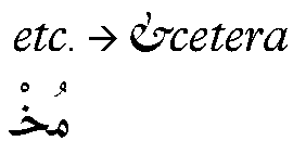
Here’s something from my own collection of curiosities, a wooden ampersand from an antique type magazine. &&001And there’s a story I could tell about it which would be more or less ‘true,’ but there are better stories yet to be invented.

Or, tell the story of Cornell’s “Observatory Box.”

http://www.thisisnotacraft.com/

“Observatory Box,” Joseph Cornell

Proofreading

Every Living Thing–The Life & Times of a Glasgow Vet Student has a cute anecdote regarding the value of careful proofreading and how small mistakes can be inconvenient and costly at the customs line. Who thinks to proofread a passport or visa? Well…

Proofreading is how I began my so-called career many years ago, and the habits I learned follow or perhaps plague me still. For example, I’m currently reading Hilary Mantel’s 1992 novel A Place of Greater Safety and finding the text riddled with typos. The most common error is a missed quotation mark–not surprising because Mantel takes a unique approach to setting  up dialogue. But it’s dismaying to find that a major publisher allowed so many mistakes to slip through, and it interrupts my reading pleasure.

Years ago, I saw Edna O’Brien reading at the 92nd Street Y in New York City. She read from one of her short story collections, and at one point she paused, adjusted her reading glasses, and stated: “Typographical error, Farrar, Straus, Giroux.” Called out on the podium, publishers!

Online sites host the largest number of typos and outright grammatical or mechanical mistakes, but paper texts aren’t as reliably correct as they once were. The New York Times has become quite lax lately; three months ago, I even found a typo in The New Yorker!

Proofreading services

I understand why there are so many more typos these days–there are so many fewer proofreaders. It gets expensive, hiring all those human beings to inspect the small details of every text, and publishers are not making as much money as they once did. How many picky readers like me exist? Probably not enough of us that we could stage a book-buying boycott demanding that Random House hire more proofreaders (people like me could never really stage such a boycott–we’re too addicted to books).

Computers, however, are not yet intelligent enough to catch the shimmery, shifting nuances of the English language and its attendant finery in the shape of punctuation and capitalization, footnoting and italicization. So there will be mistakes, and I guess I can live with that. “To err is human,” and all that. And Mantel is a fine writer.

Outside the (type) box

Many years ago, back when there was a career called typographer, I was one. I apprenticed to typographers because I had superior proofreading skills, a background in art and design, there was a recession, jobs were few, and I was a quick learner. In an essentially blue-collar job, I was decidedly outside the box: I was a 21-year-old female with a BPhil in philosophy and literature. But I was a terrible waitress. So, in desperation, I essentially talked my way into a job at a typeshop in New York.

A voracious reader all my life, I felt attracted to the potential type offered for expression via the medium of words. I’d studied art since the second grade, so the aesthetic side of typography fascinated me, too. I got into the business just as the field was waning due to the innovations offered by phototype methods, digital typography, and the invention of desktop publishing. Nevertheless, typography kept me fed and housed for a few years while I learned to discern the differences between various counters, serifs, descenders, dashes,  x-heights, weights and the rest. I read books on the history of type design and the history of the alphabet itself. My obsession with words and letters kept me inside the typography box, though I suppose I was often more like a stray Caslon e in the Helvetica drawer.

Wood type was no longer in use, but I used to purchase wooden type fonts–the individual letters–and type cases, because they are so folk-art-appealing and so potentially useful. As collectors began to scour flea markets for wooden type, I bought metal fonts and slugs instead; I’m particularly fond of ampersands and dingbats. (If you’re in Wisconsin and you want to see what the age of wooden type in the USA was like, check out the Hamilton Wood Type and Printing Museum.)

Two of the shops I worked at still used metal type occasionally, though they had mostly switched to digitally-mastered film type; and one shop boasted three Linotype machines. Two of the machines worked. The other was there for parts. The typesetters were all WWII veterans, and the smell of molten lead wafted through the building…it really felt like the end of an era. And it was.

Mergenthaler’s Linotype machine

Working at typeshops engaged my brain in novel kinds of problem-solving and detailed observation, taught me about the lives and careers of men who could have been my great-uncles, satisfied–sometimes–my yearning for aesthetics in the workaday world. An elegant logo or headline still pleases me. I learned about all kinds of odd and wide-ranging things while proofreading, too, while I marked up thousands upon thousands of proof pages; and during my breaks, I read novels. One old-timer at a shop I used to work at told me, “Every proofreader I ever knew read books on his break.” He shook his head as if that were sheer lunacy.

Today, I might note that every computer programmer I know spends his or her break time (and post-work hours) at a computer. It is nice to love something about the work one does for a living.

Typographers today are designers and computer graphics folks who understand how to digitize and digitally set and “cut” fonts for virtual pages. The design tolerances are different, though the challenges of readability and clarity and appropriateness remain. As for proofreaders, there are fewer every year, even though we certainly could use them. AutoCorrect and SpellCheck are woefully inadequate proofreading systems, as I constantly remind my students who don’t know your from you’re or their from there or then from than.

And as for me, I have moved from proofreader and typographer to tutor, instructor, poet…jobs that suit me a bit better, where my quirkiness is more tolerated and thus more conventionally acceptable. I continue to admire thinking and being that is outside of the box, however, and in that spirit I offer you some artwork that moves type outside of its outmoded, old-fashioned box. Click on the cityscapes link to find metal-type cityscapes by Hong Seon Jang. For what artists can do with letters, see also my earlier post on Steve Tobin’s sculpture, “Syntax.”