Decisions, revisions

Currently, I’m deeply immersed reading two very different new books of poetry. First, the late Harry Humes’ new and selected, Going across the Water, is out from Ohio University Press–a lovely, large collection that includes some biography and commentary, as well as some never-collected new poems (Harry’s former student and long-time friend, Daniel Donaghy, edited and co-compiled the selections). Some of the poems are a re-read for me, as I have most of Harry’s books in my own library, but they’re poems well worth many reads. And the work I’m less familiar with is rewarding. He was so good. The other collection I’m perusing at present is Daisy Fried’s brand-new My Destination, which could hardly be less like Humes’ in terms of topic, content, style, you-name-it. Katie Peterson writes that Fried’s book succeeds because of “the poet’s unapologetic curiosity about experience, and her remorseless hunger for the right words to know her moment…” I’ll concur, though I am only part-way through the collection. It’s fascinating to find myself enjoying the work of two such dissimilar writers at the same time; and I find they do have “things to say to one another,” at least through me as intermediary. Strongly evocative and well-observed poems in both cases.

~

And today I spent awhile obtaining a more complete idea of how much time and effort I’ll have to put in to my own artist book endeavor. So many new things I’ll have to learn to do, and how I’ll have to be much more finicky and careful than I usually am, if I want this book to be worthy of its story. Any project of value is liable to take energy, time, resources of one kind or another, and will require at least some revision, however. That’s my line, and I’m sticking to it.

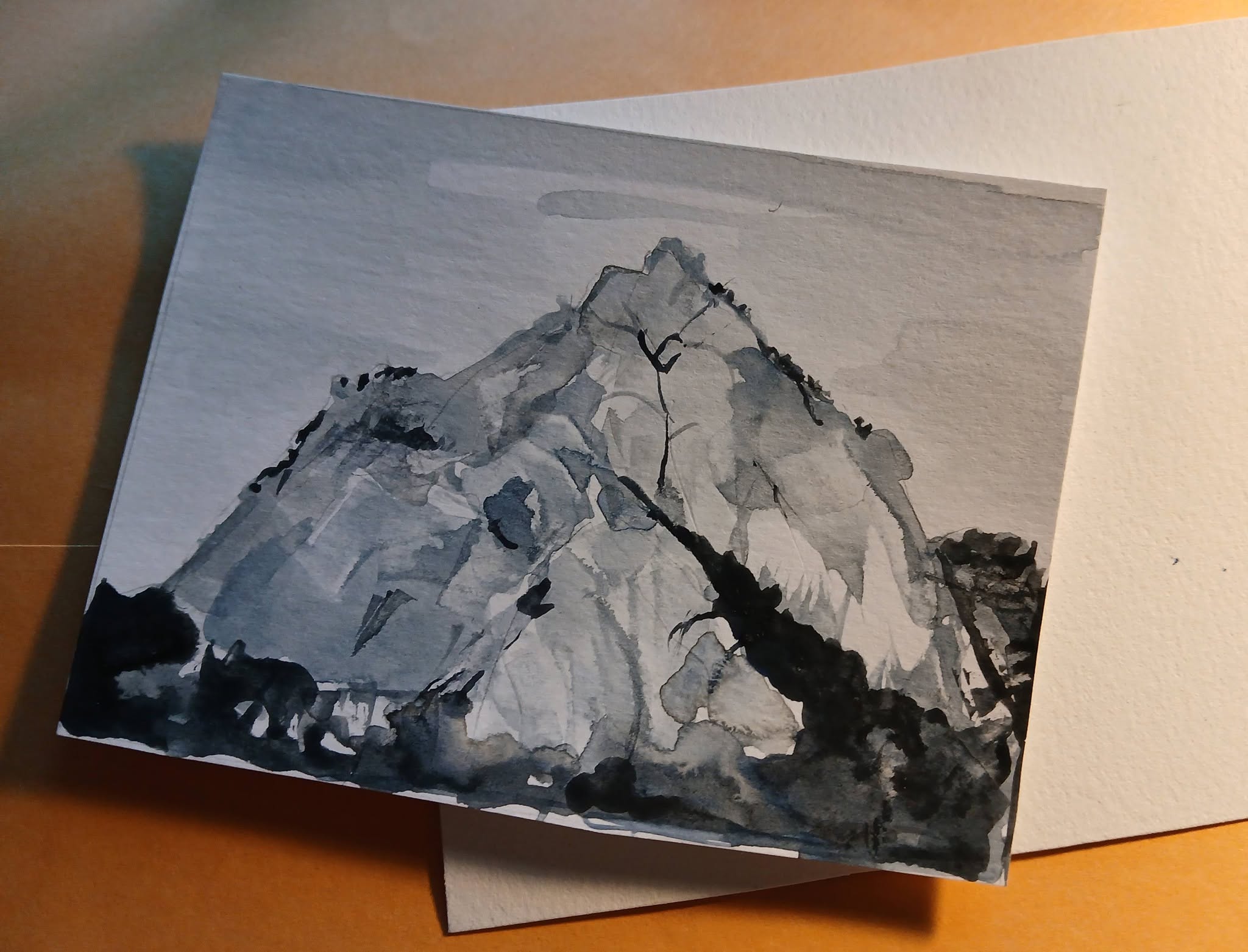
I have the layout almost correct: a few minor revisions should do it. The choice of paper? Check, except for the cover stock, still deciding on that. Of course, I have to do some math to figure out how much paper to buy and then get it cut to size. Do-able. Not a huge challenge, right? I spent an hour with my knowledgeable “consultant,” MaryAnn Miller, deciding on a cover image and learning what the steps of actually manufacturing (ha) a book will be. I was afraid my amateurish artwork wouldn’t be appropriate; but she thought that it might be best with something not so polished, something I could use without getting copyright for, something a bit–er–primitive. I experimented with linocut, something I haven’t done in decades, and with watercolor (in my class at Blue Church Arts), based upon a photograph I’d researched. It’s one of the craggy, cold mountains in western North Korea not far from the Yalu River.

I’ve no way of knowing whether this particular peak is near where prisoner Camp 5 was located, but it gave off the kind of forbidding vibes I was looking for. Trying to capture it with my rusty and limited skills kept me occupied for many hours.
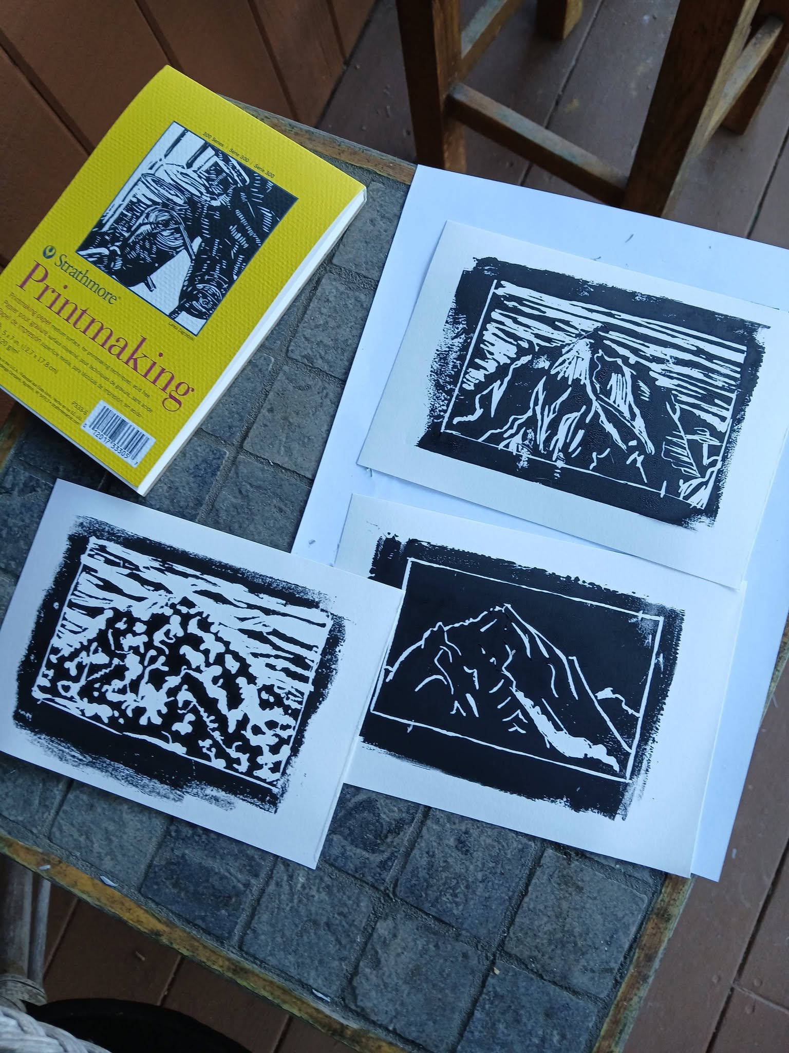
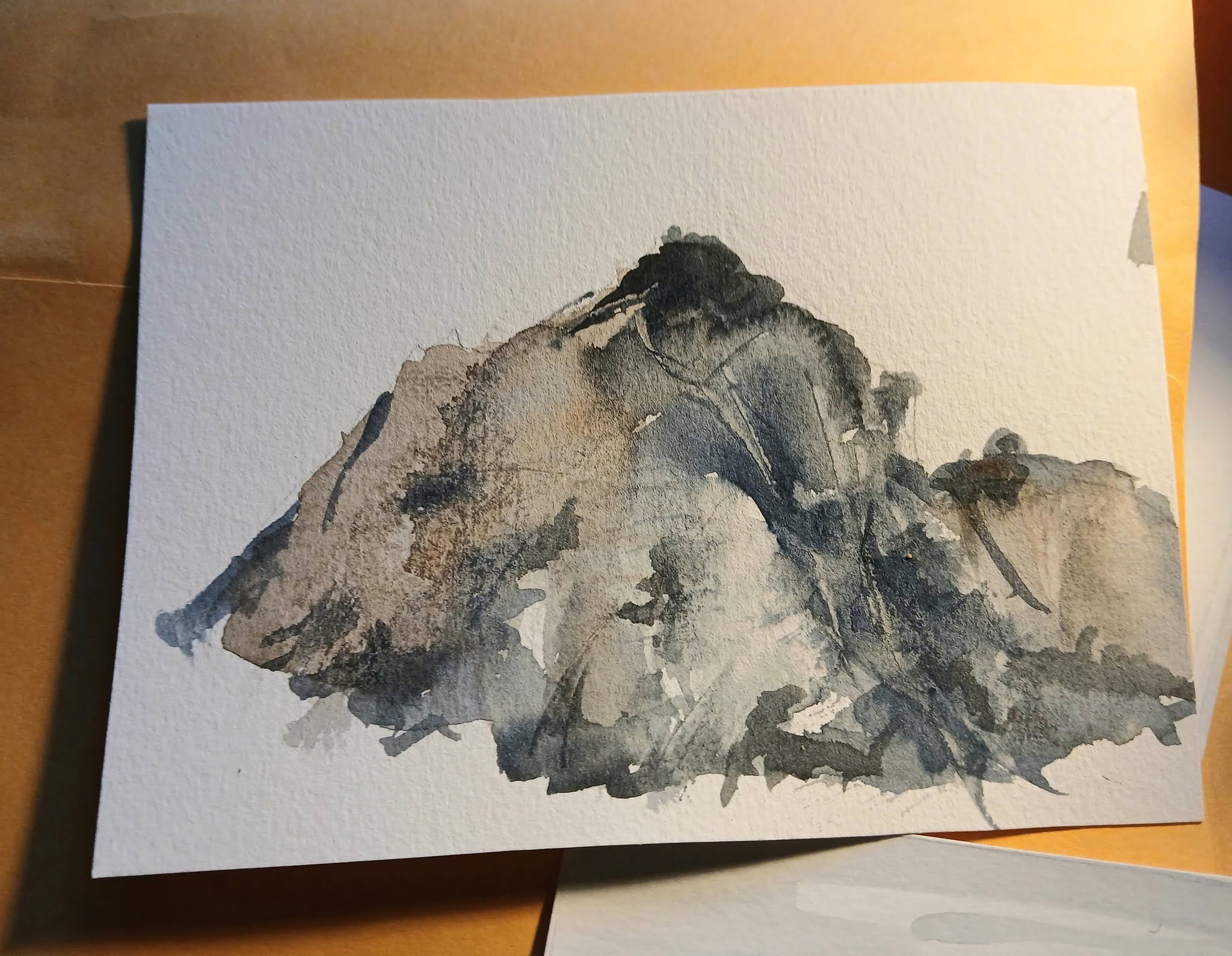
This was exciting, working with something that isn’t words, wrestling with the materials, trying several techniques. Deciding, revising!

So, the process continues.

“Local” artists & genius loci

Recently, a friend and I visited our small, local art museum (Allentown Art Museum). The permanent collection there has a few real highlights, which for me include the Frank Lloyd Wright-designed library from the Francis Little House and a limited but fine collection of glass and ceramic decorative arts. Like many smaller US museums, the Allentown Art Museum hosts traveling exhibits that can be eye-opening (last year’s exhibit of Lautrec’s works on paper, currently at Washington Pavilion in Sioux Falls, SD, was one of these).

Currently, Allentown’s museum is featuring work by two artists who employ very different methods, and their styles are so different that it seems silly to compare them: Matthew Daub and Paul Harryn. Both of them live in the region, however, and both might be considered painters of place.

Harryn says he is enthralled by the concept of genius loci, and there’s a decidedly spiritual aspect to his work (as well as a philosophical and poetic aspect; view his site for inklings of these). His “Changing Seasons” series stretched along one wall of the museum gallery, initially seeming like a seamless continuum, though more careful observation proved otherwise. The seasons series anchors the viewer in a temperate region in which the hues and moods of four distinct seasons are markedly obvious by color and light. In these works, the layering and erasing methods he employs are subtle, but some of the larger works depend upon a more visible shifting and experimental approach to media manipulation. The image of “Pacificus” on his website doesn’t begin to convey the experience of his assemblage paintings, which are textural, shifting, very large, and compellingly active. These three “Transcripts” were charming, if less powerful than some of the more layered works:

Transcript series by Paul Harryn

~

The near-monochrome, panoramic watercolors of Matthew Daub’s Maiden Creek series also appealed to me because of place, specific–definite–“realistic” place, if not as obviously spirit of place. This is because I know the roads and streams he depicts very well, have traveled them often; but I have seldom considered them “beautiful” enough for plein air views or photographic compositions (without omitting, say, road signage, utilitarian concrete bridges, highway off-ramps, minivans, and the like).

Daub portrays those items in his photorealistic paintings. What I found revelatory in these works is how genuinely beautiful those familiar roads are when the view or frame changes. The thin horizontal rectangle of Daub’s place-paintings accentuates parts of the composition such as bare tree branches, shadows on the curved roads, the rough texture of municipal concrete next to embankments. Daub’s choice of subject matter reminds me a bit of the later paintings of Charles Demuth, but Daub’s paintings include more of the natural environment surrounding the silos, stairs, and industrial objects.

Aucassiu and Nicolette (1921) by Charles Demuth [public domain, Wikimedia Commons]

Next time I am driving Route 143 near Kempton, I will appreciate the scenery more for having acquired, through Daub, a new perspective on the dull, drab, too-familiar landscape. The aesthetics of road-building, New Jersey barriers, highway ramps, creekside roads, and galvanized silos blend surprisingly well with the brushy trees, gentle hills, and stone barns of Berks County.

~

I’ll close with a poem by Maggie Anderson, from her now, alas, out-of-print book Cold Comfort (1986). Daub’s paintings made me think of this one, though the river is different.

Gray

Driving through the Monongahela Valley in winter
is like driving through the gray matter
of someone not too bright but conscientious,
a hard-working undergraduate who barely passes.
Everybody knows how hard he tries. I’m driving up
into gray mountains and there, it may be snowing
gray, little flecks like pigeon feathers, or what
used to sift down onto the now abandoned slag piles,
like what seems to sift across the faces
of the jobless in the gray afternoons.

At Johnstown I stop, look down the straight line
of the Incline, closed for repairs, to the gray heart
of the steel mills with For Sale signs on them. Behind me,
is the last street of disease-free Dutch elms in America,
below me, a city rebuilt three times after floods.
Gray is a lesson in the poise of affliction. Disaster
by disaster, we learn insouciance, begin to wear
colors bright as the red and yellow sashes on
elephants, whose gray hides cover, like this sky,
an enormity none of us can fathom, though we try.

(© 1986 Maggie Anderson)